
We are using several tools to monitor how users are interacting with the system. One of the tools we use allows us to see a heat map of where users are clicking. If we notice an area on the heat map with a lot of bright colours, we can determine that a user is interacting with this area of a page. For example, if the colour is pale, it means it has had some interaction, but the interaction has been low. If an area has a bright colour, it means that an area has had a high degree of interaction.
Obviously, there are part of the page that we expect a user to click a lot, for example, the book buttons, or the dates on the calendar. However, sometimes we see a high degree of interaction with parts of the page that surprise us. None more so than in the following diagram:
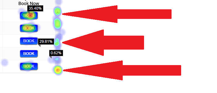
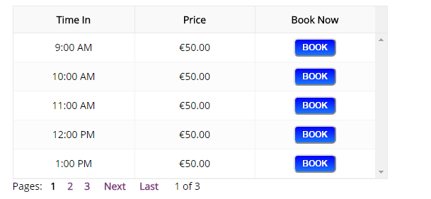
The bright colours indicate that a large number of users are clicking on the disabled scroll bar. This is likely frustrating them as nothing happens when they click here. Here is the same area with the heat map disabled. Notice the scroll bar to the right of the ‘Book’ buttons. It is greyed out and actually not serving any useful purpose.
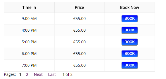
As you can see, the numbers below the table allow the user to see later times. There really is no need to confuse the user with the disabled up and down scroll arrows. Therefore, our latest release completely removes the disabled scroll bar meaning the online booking timetable will look as so:
This product update is an example of how we constantly monitor user interaction in an effort to make it as easy as possible for a user to make an online booking.